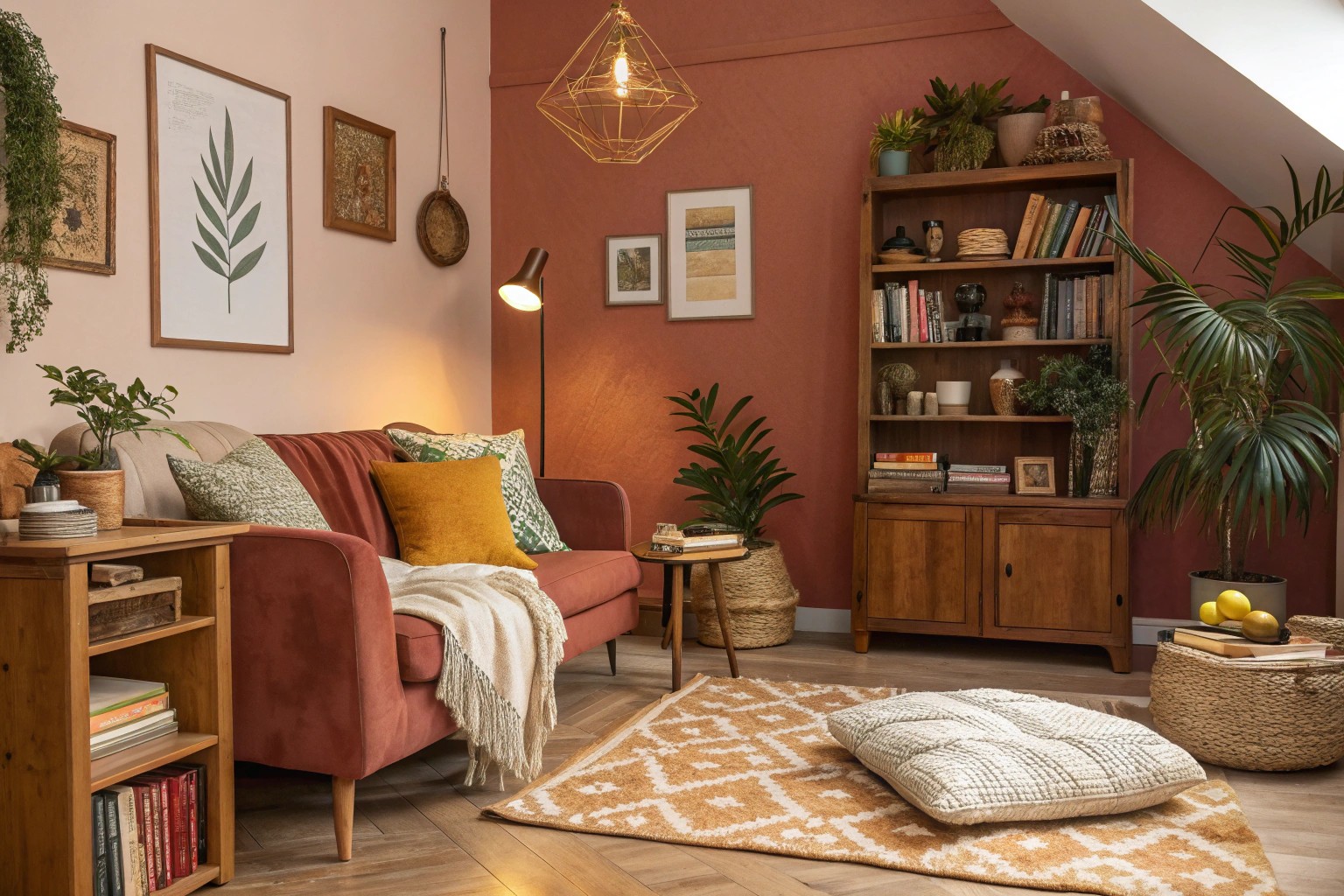
Color combinations that challenge conventional wisdom often create the most memorable and sophisticated interiors. While traditional palettes feel safe, strategic use of unexpected color pairings can transform ordinary spaces into extraordinary environments that reflect genuine personality and design confidence.
Understanding the Science Behind Surprising Color Harmony
The foundation of successful unexpected color combinations lies in understanding complementary color theory and visual balance principles. Complementary colors sit opposite each other on the color wheel—such as blue and orange, or yellow and purple—and create natural contrast that energizes a space. However, the magic happens when we move beyond these obvious pairings to explore adjacent relationships and nature-inspired combinations.
Color harmony emerges from three key principles: contrast, balance, and proportion. When unexpected colors work together, they typically share an underlying temperature relationship or tonal quality that creates visual cohesion. For instance, mustard yellow and dusty lavender both contain earthy undertones that allow them to harmonize despite their apparent differences.
Modern color theory recognizes that successful pairings often mirror combinations found in nature—think lichen and moss, or sunset skies where coral meets deep blue. These organic relationships provide a subconscious sense of rightness that makes even the most surprising combinations feel intentional and sophisticated.
The Psychology of Bold Color Choices
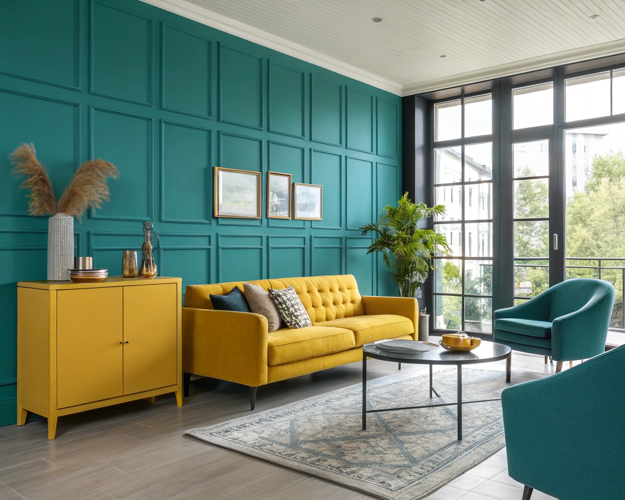
Research in environmental psychology demonstrates that unexpected color combinations can significantly impact mood and spatial perception. Warm colors tend to advance visually and create intimacy, while cool colors recede and open up space. When balanced thoughtfully, contrasting temperatures create dynamic tension that keeps spaces visually engaging without overwhelming occupants.
Professional designers often leverage this principle by using what I call the “focus and fill” approach. Interior designer Julee Wray explains this technique: “We try to use more warm tones on areas of focus as you walk into each room, and filling in with the secondary cooler tones”. This strategy ensures that unexpected combinations feel grounded rather than chaotic.
The emotional response to color is deeply personal, but certain unexpected pairings consistently evoke specific feelings:
- Sage green and dusty pink create calming sophistication
- Navy blue and burnt orange generate confident energy
- Mustard yellow and lavender produce playful serenity
- Charcoal and soft peach establish modern warmth
Top Unexpected Color Duos That Transform Spaces
Mustard Yellow and Dusty Lavender
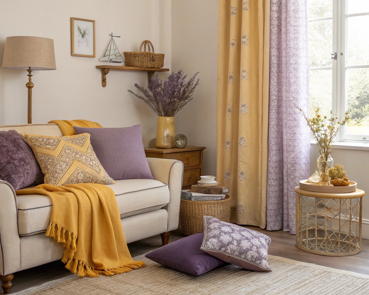
This pairing represents one of the most versatile unexpected combinations in contemporary design. The earthy richness of mustard finds perfect balance in lavender’s cool sophistication. The combination works because both colors contain muted qualities that prevent either from overwhelming the space.
Implementation strategies:
- Use mustard as accent color on throw pillows and artwork (10% of space)
- Apply lavender to secondary furniture pieces like chairs or curtains (30% of space)
- Maintain neutral walls in warm white or soft gray (60% of space)
I’ve found this combination particularly effective in reading nooks and home offices, where the balance of energy and calm supports both creativity and focus.
Navy Blue and Burnt Orange
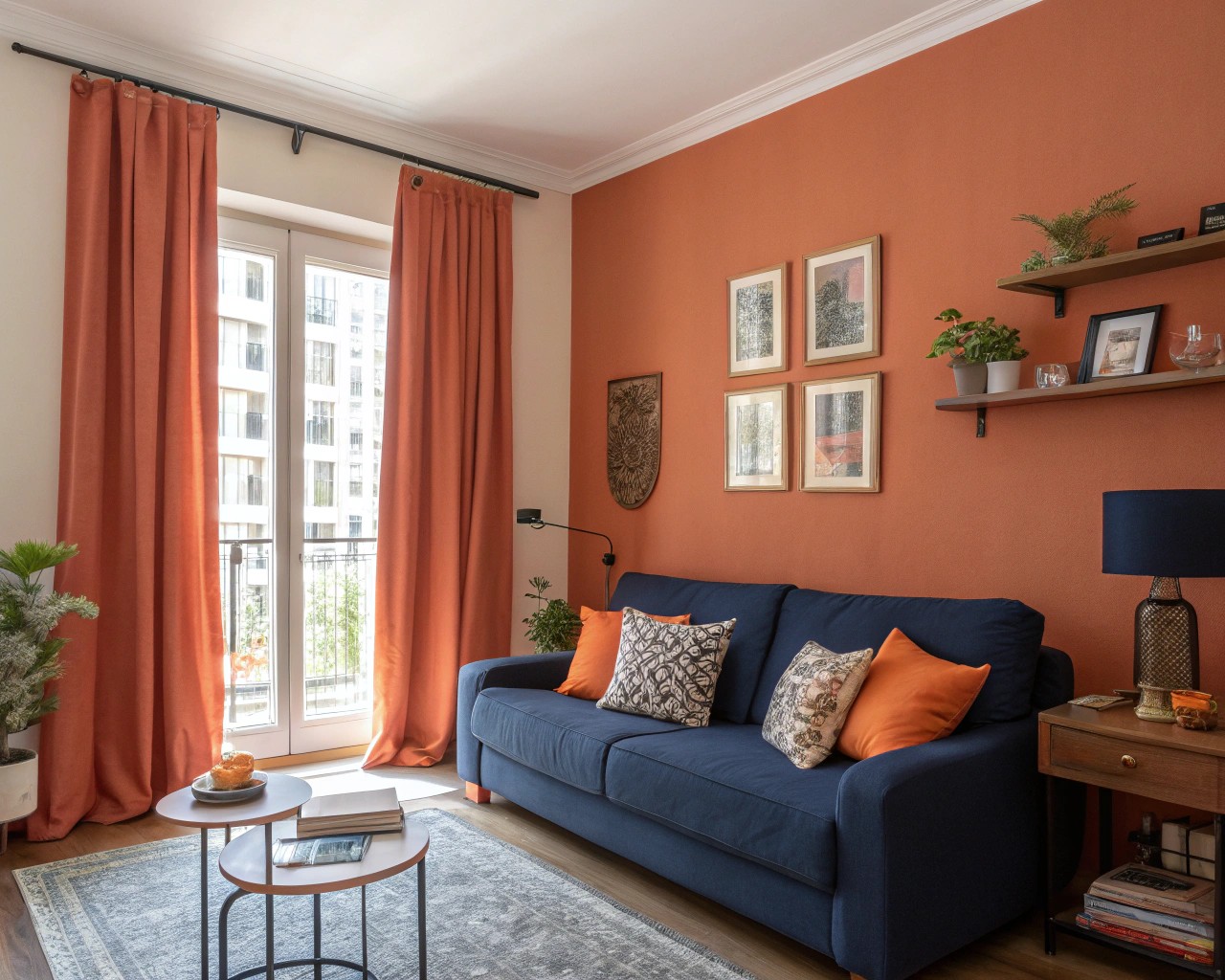
This classic complementary pairing gains sophistication through careful tone selection. Deep navy provides grounding stability while burnt orange adds warmth without appearing juvenile. The combination works exceptionally well in spaces that need both authority and approachability.
Room applications:
- Living rooms: Navy sectional with burnt orange throw pillows and artwork
- Home offices: Navy accent wall with orange desk accessories and lighting
- Bedrooms: Navy bedding with orange lampshades and decorative objects
Sage Green and Blush Pink
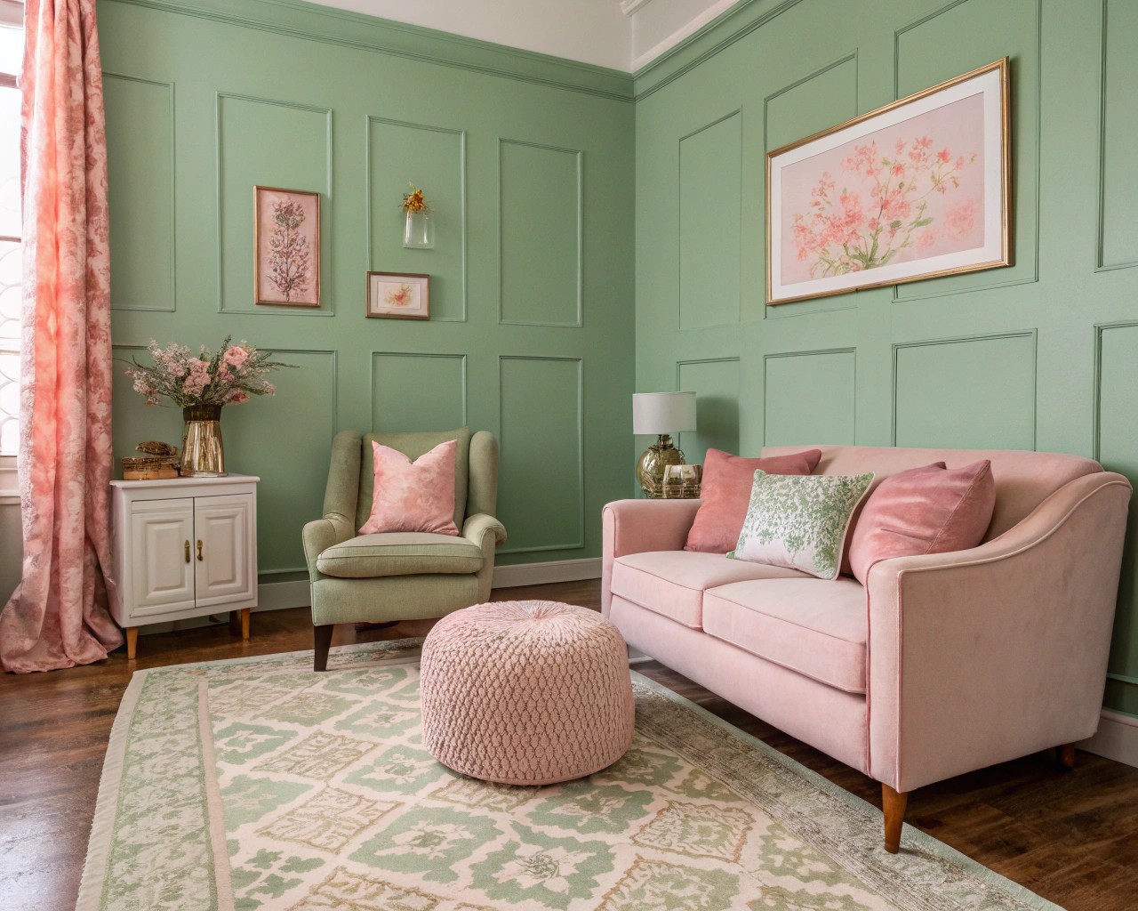
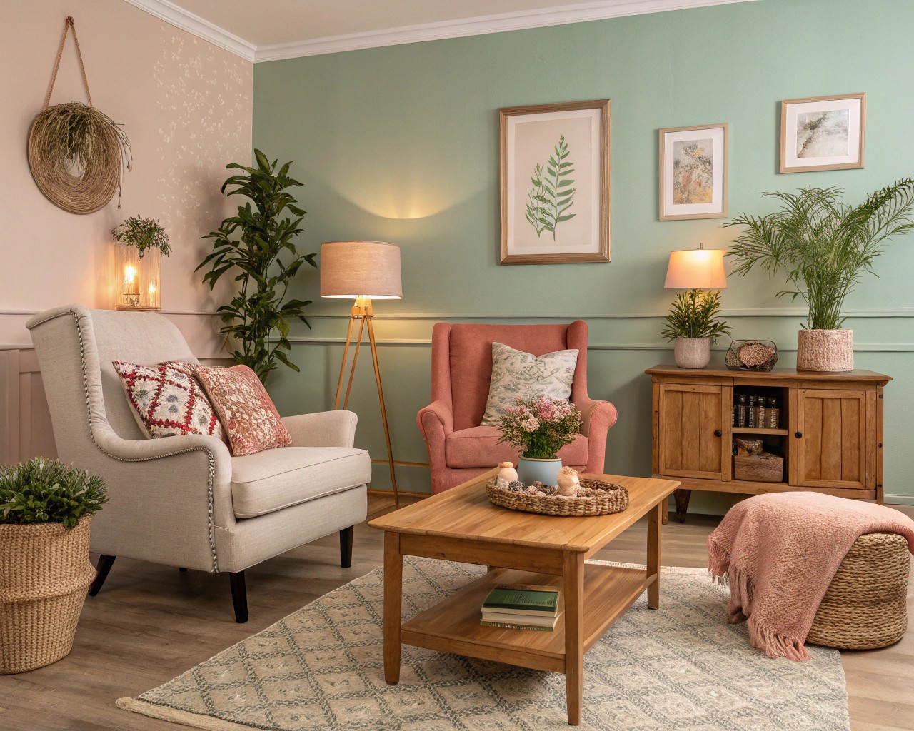
Perhaps no unexpected combination feels more naturally harmonious than sage green and blush pink. This pairing draws inspiration from garden settings where soft florals meet silvery foliage. The combination creates spaces that feel both grounded and optimistic.
The success of this pairing lies in its tonal relationships—both colors share similar saturation levels and contain gray undertones that create visual unity. When implementing this combination, consider varying the intensity through different textures and finishes rather than relying solely on pure color.
Charcoal Gray and Soft Peach
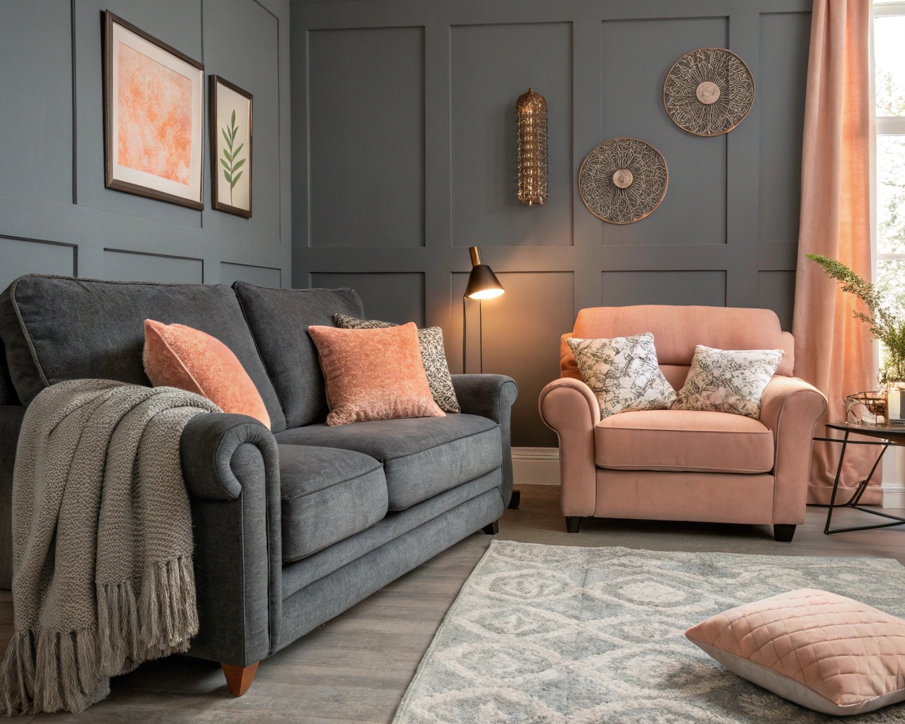
This sophisticated pairing challenges assumptions about gray’s limitations as a base color. The deep, grounding quality of charcoal brings out peach’s subtle warmth while preventing it from appearing overly sweet. The combination creates modern elegance that feels both bold and approachable.
Professional tip: Use charcoal on elements with the strongest visual weight—walls, large furniture pieces, or flooring—while introducing peach through textiles, artwork, and accessories that can be easily updated.
Strategic Implementation Using the 60-30-10 Rule
The most successful unexpected color combinations follow established proportion principles. The 60-30-10 rule provides a foolproof framework for implementing bold color choices without overwhelming a space.
| Percentage | Application | Color Role | Examples |
|---|---|---|---|
| 60% | Dominant color | Walls, large furniture, flooring | Neutral base, major furniture pieces |
| 30% | Secondary color | Supporting furniture, window treatments | Chairs, curtains, area rugs |
| 10% | Accent color | Accessories, artwork, lighting | Pillows, vases, lamp shades |
This proportion system allows unexpected combinations to feel intentional rather than accidental. When working with bold pairings like cobalt blue and marigold, place the more intense color in the 10% accent role while using the calmer color for larger applications.
Color Temperature Balancing
Successful unexpected combinations almost always involve balancing warm and cool temperatures. Consider these proven strategies:
For warm-dominant schemes:
- Use 60% warm neutral (cream, warm gray, soft beige)
- Add 30% cool secondary (sage green, dusty blue, lavender)
- Accent with 10% warm pop (coral, mustard, terracotta)
For cool-dominant schemes:
- Use 60% cool neutral (soft gray, pale blue-gray, white)
- Add 30% warm secondary (camel, rust, soft pink)
- Accent with 10% cool pop (navy, forest green, plum)
Room-by-Room Application Strategies
Living Rooms: Creating Conversation Spaces
Living rooms offer the most flexibility for unexpected color experiments due to their larger scale and multiple furniture pieces. The key is establishing visual flow while maintaining focal points that draw attention.
Mustard and periwinkle combination:
- Periwinkle sectional sofa (30% secondary color)
- Mustard accent chairs and ottoman (20% accent distribution)
- Neutral walls in warm white (60% dominant)
- Balance through artwork and accessories
This pairing “feels playful without being childish, and sophisticated without ever feeling stuffy”. The combination works particularly well in spaces with abundant natural light, where both colors can maintain their integrity throughout the day.
Bedrooms: Balancing Energy and Calm
Bedrooms require careful consideration of color psychology, as these spaces must support both morning energy and evening relaxation. Unexpected combinations can add personality while maintaining the restful qualities essential for sleep.
Sage green and dusty pink bedroom:
- Sage green accent wall behind headboard (20% application)
- Dusty pink bedding and window treatments (30% secondary)
- Neutral furniture and remaining walls (50% dominant)
- Metallic accents in brass or copper (trace amounts)
Kitchens: Energizing Without Overwhelming
Kitchen color schemes benefit from unexpected combinations that stimulate appetite and conversation while maintaining functionality. Bold pairings work best when balanced with neutral surfaces that won’t compete with food preparation.
Navy and burnt orange kitchen:
- Navy lower cabinets (25% application)
- Burnt orange tile backsplash (15% application)
- White or cream upper cabinets and walls (60% dominant)
- Natural wood accents for warmth
Advanced Techniques for Color Confidence
Gradient Implementation
Rather than using unexpected colors in their pure form, consider creating tonal gradients that ease the visual transition between contrasting hues. This technique works particularly well with bold combinations like fuchsia and yellow.
Gradient strategy example:
1. Start with the lightest version of your accent color
2. Progress through medium tones in your secondary color
3. Anchor with the deepest shade of your dominant color
4. Connect all three through shared undertones
Texture as Color Mediator
Texture can significantly impact how colors appear to relate to each other. Matte surfaces absorb light and appear more muted, while glossy surfaces reflect light and appear more vibrant. Use this principle to fine-tune unexpected combinations:
- Matte textures: Calm bold colors, make them more approachable
- Glossy textures: Energize muted colors, add sophistication
- Natural textures: Bridge the gap between disparate colors
Lighting Considerations
Color relationships change dramatically under different lighting conditions. Unexpected combinations that work beautifully in natural daylight may appear harsh under cool LED lighting or muddy under warm incandescent bulbs.
Lighting strategy for unexpected colors:
- Test color samples under all lighting conditions present in the room
- Use warm LED bulbs (2700K-3000K) to support most unexpected combinations
- Add task lighting to highlight accent colors effectively
- Consider dimmer switches to adjust color intensity throughout the day
Common Implementation Mistakes and Solutions
Mistake 1: Equal Color Distribution
Problem: Using unexpected colors in equal proportions creates visual competition and chaos.
Solution: Always establish a clear hierarchy using the 60-30-10 rule. Even the most harmonious unexpected combinations need proportional balance to succeed.
Mistake 2: Ignoring Undertones
Problem: Focusing only on surface colors while ignoring undertones leads to combinations that feel “off” despite following color theory.
Solution: Test colors together in your specific lighting conditions. Look for shared undertones—warm, cool, or neutral—that create subtle connections between unexpected pairings.
Mistake 3: Overwhelming Small Spaces
Problem: Using bold unexpected combinations inappropriately in small rooms can make spaces feel cramped and chaotic.
Solution: In spaces smaller than 200 square feet, limit unexpected combinations to the 10% accent role. Use one surprising color as a pop against a neutral background rather than attempting full-scale bold pairings.
Mistake 4: Seasonal Inflexibility
Problem: Implementing unexpected combinations without considering seasonal adaptability leads to spaces that feel inappropriate during certain times of year.
Solution: Choose unexpected combinations that can be seasonally adjusted through accessories. For example, sage green and blush pink can feel fresh in spring with light textiles, and cozy in fall with heavier textures and warmer lighting.
Maintaining Design Longevity
Unexpected color combinations require careful consideration of longevity versus trend appeal. While bold choices create memorable spaces, they should still feel relevant years after implementation.
Strategies for lasting appeal:
- Choose combinations inspired by nature rather than current fashion trends
- Implement the boldest elements through easily changeable accessories
- Select unexpected combinations that reflect your genuine preferences rather than external influence
- Plan for evolution by choosing base colors that work with multiple accent options
The most successful unexpected color combinations feel both surprising and inevitable—as if they were always meant to be together. This balance comes from understanding both the technical principles of color harmony and the intuitive relationships that make certain pairings feel naturally right.
